Quite a long post today, to make up for the lack of recent updates. There are a lot of big images here, so this may take a while to load.
Throughout his career as an illustrator Gustave Dore proved that he could adapt to a variety of genres. Despite his productivity and his ambition to illustrate all of the world literary classics, he didn't get around to illustrating everything. There are a number of reasons; in his biography of Dore Dan Malan notes that publishers would rarely pay for both a great author and a great illustrator, so most of the Dore illustrated classics are public domain properties. In a couple of cases, seminal illustrations for these works had been released by other artists, and Dore steered clear. The final few on this list were never illustrated by Dore simply because he died before they were written.
I've picked ten classics of literature which I feel it was a pity he never illustrated, listed below in chronological order.
1. Geoffrey Chaucer, The Canterbury Tales (late 14th C)
Despite the inspiration Chaucer offers artists, there have been relatively few illustrated editions of the
Tales. Perhaps the varying styles of the stories themselves have presented a challenge. Manuscripts of the
Tales, such as the Ellesmere Chaucer, tend to illustrate only the pilgrims. Later illlustrated versions contain some interesting illustrations of the stories themselves, but my favourite illustrations are the portraits of the pilgrims by James Jeffrys, which were never published in his lifetime. The Kelmscott Chaucer, designed by William Morris and illustrated by Sir Edward Burne-Jones, is one of the most beautiful books ever made. In 2008 Barry Moser, perhaps the greatest living illustrator, mentioned an ambition to print his own illustrations.

The many different styles of the individual tales could be said to have been covered by Dore at different points in his career. The Arthurian setting for the Wife of Bath's Tale most obviously appears in his
Idylls of the King illustrations (above). Demons as they appear in the Friar's and Prioress' tale, amongst others, are comparable visually to the cast of
Dante and
Paradise Lost. The atmosphere of the Knight's Tale is very present in Dore's illustrations for
The Crusades and
Orlando Furioso.
Burne-Jones, for all the beauty of his illustrations, can not be said to have created the definitive illustrated Chaucer: the Kelmscott Chaucer only features illustrations for the more pious stories, like the Knight's and Prioress' tales. Dore, however, would have been comfortable not only with the nobler subjects, but also the more vulgar, bawdy tales - like those of the Miller, the Reeve and the Cook. He would have had particular fun with part of the prologue to the Summoner's tale, in which a demon asks Satan to 'lift up thy ars', and a swarm of friars flies out of the devil's anus. Dore had already perfected comical monks in his
Contes Drolatiques illustrations (above).
But Dore would probably have had the most fun with the Pardoner's tale, in which three crooks try to capture and kill Death, but end up, like all the rest of us, ensnared by their prey. Death appears in Dore's work more than any other figure, particularly in
Contes Drolatiques (above),
The Rime of the Ancient Mariner (below) and
The Raven.
Dore probably never illustrated Chaucer because he wasn't terribly good with English, and Shakespeare was far more popular and accessible. But even though it was his ambition to produce a lavishly illustrated Shakespeare, I can't help thinking that Chaucer would have served Dore better. His illustrations for
Don Quixote and
Rabelais in particular show that he would have had little trouble finding an appropriate style for portraits of the pilgrims.
2. One Thousand and One Nights (first appeared in Europe 1704)
'The
Arabian Nights is more generally loved generally loved than Shakespeare,' declared Robert Louis Stevenson. 'No human face or voice greets us among (this) crowd of kings and genies, sorcerers and beggarmen. Adventure, on the most naked terms, furnishes forth the entertainment and is found enough.' The appeal of these stories is their pure fantasy. The one thousand cliffhangers are all placed such that the reader persists until the end of the entire book. It has probably been illustrated more times than any other book on this list (with the possible exception of
Grimm's Fairy Tales), though rarely in its entirety. Particularly fine illustrations have been done by Edmund Dulac and Maxfield Parrish, but my personal favourites are probably those by Rene Bull in 1912. Many of the stories have been released individually: there is an excellent illustrated
Sindbad by Quentin Blake.
With his work ethic, Dore is one of the few artists who could have illustrated all of the
Arabian Nights, probably with time to spare. The speed with which he executed the
Orlando Furioso illustrations (above and below) suggests a passion for myth and fantasy - is there any work of literature that offers fantasy more copiously than the
Nights, with their sublime worlds of castles, caves and clouds, and an endless cast of Genies, giants, magicians and ghouls? He would have had perhaps more fun than with any other subject.

He presumably didn't illustrate the whole thing because it would have been too expensive. It's difficult to think of how a lavishly illustrated edition could be published and sold affordably; perhaps the
Arabian Nights could have been released periodically in volumes, though it would have been an enormous set. But according to Edmund Ollier, Dore was planning to illustrate the
Nights after his never completed Shakespeare illustrations.
Dore did actually do nine full-page illustrations and eleven vignettes for a small but famous part of the Arabian Nights: the story of Sindbad the Sailor, and his Seven Voyages. Of these, the most striking is probably the image of Sindbad being lowered into the tomb, where he will be buried alive. The Sindbad illustrations are very scarce but worth a look. Ray Harryhausen has acknowledged the influence of Dore's fantasy illustrations on his work in films.
3. Jonathan Swift, Gulliver's Travels (1726)
Jonathan Swift's classic takes the hero through four distinct worlds, each with its own perils and delights. Of course, one of Gulliver's voyages inspired the 1939 Fleischer film. My favourite illustrations are those by Grandville, which I'll cover in more detail later.
This would have been an ideal subject for Dore, with its fantastical locations and tremendous scale mixed with humour. The tone is comparable to
Baron Munchausen (above),
Rabelais and
Don Quixote, which Dore demonstrated a particular affinity with.
The most influential artist on Dore's work in his early career was J. J. Grandville, undoubtedly one of the greatest illustrators of all time. Grandville is best known for his illustrations for
Un Autre Monde in 1844, which were appropriated by the Surrealists in the 20th Century. He saw the young Dore's drawings and encouraged him to persist. We can see how much Dore admired Grandville in his childhood drawings of dogs, insects and other creatures acting like civilised people. Yet a comparison between the way the two illustrators interpreted the
Fables of LaFontaine demonstrates just how much Dore changed later on in his career.

Anyway, it was with Dore's
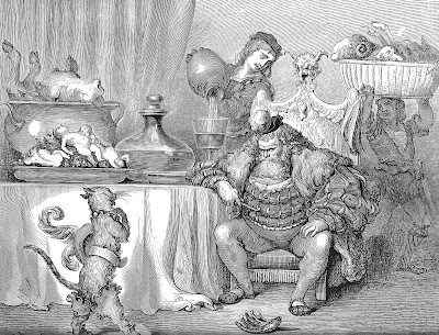
Rabelais illustrations of 1854 (above) that he first emerged as a serious illustrator of literature. A comparison shows that Grandville's 450
Gulliver illustrations must have been at least part of Dore's inspiration when he tackled
Rabelais. Both feature giant and/or midget characters; both refer to the more animalistic instincts of humanity; both use humour.
Rabelais is much more vulgar than
Gulliver, though Grandville did manage to sneak in an illustration of Gulliver extinguishing a fire in Lilliput in unorthodox fashion, anticipating the deluge of bodily functions in Rabelais.

Dore may have felt that any version he could come up with would have been too similar to Grandville's interpretation. But I think his take on the material would have been sufficiently original in his later career, such as when he returned to
Rabelais in 1873 with some of his very best creations (above).
4. Jacob and Wilhelm Grimm, Children's and Household Tales (1812)
These stories were all adapted from German folk tales. They are perhaps the most famous of fairy tales and have been illustrated many times. Particularly famous are those by Arthur Rackham, Charles Robinson, Kay Nielsen, Walter Crane and, perhaps my favourite, George Cruikshank. You have probably all seen Disney's
Snow White, based on the Grimms' most famous story.
Dore had already illustrated the
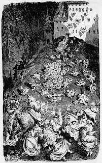
Contes of Charles Perrault in 1862, demonstrating an ability to illustrate fairy tales well (above). The Perrault illustrations have a decidedly Germanic flavour, which is why I have picked the Grimm's tales as appropriate material for Dore, but he really could have tackled other fairy tales, such as those of Hans Christian Andersen. But the frequency of monsters, witches and ogres in the Grimm's stories makes them the most ideal candidate.
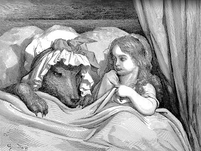
Even though they were presumably aimed at a younger audience, Dore's Perrault illustrations are probably the most frightening he ever drew. Particularly chilling are the bed scenes, such as the famous
Red Riding Hood illustration and the ogre's scene in
Hop o' my Thumb (above and below). I can't help but think of a moment in the Grimms'
Hansel and Gretel:
'Early in the morning before the children were up, she got out of bed and gazed at the two of them sleeping so peacefully with their soft red cheeks. And she muttered quietly to herself: "They will make a tasty little morsel."'
One can only imagine the terror and sexual intensity Dore could have endowed an illustration of this scene with.
 5. Johann Wolfgang von Goethe, Faust (1806, 1832)
A seminal interpretation of the popular legend of Doctor Faustus, giving rise to many more artistic interpretations. A few highlights of many: Peter Cornelius created some fine illustrations in 1816. Moritz Reitsch replaced the Germanic roots of the story with Classical influences in his illustrations of the same year. Eugene Delacroix's 1827
Faust lithographs introduced Romantic illustration to France. A beautiful, lavish set of illustrations by Harry Clarke was published in 1926; see my post about them
here. There is also F. W. Murnau's amazing film, also released in 1926.

Edmund Ollier suggested Goethe's masterpiece as a good subject for Dore to illustrate in his Essay in
The Dore Gallery. The Germanic setting is familiar in his illustrations for
Contes Drolatiques and
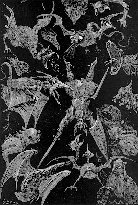
The Wandering Jew (above). No doubt he would have relished scenes of violence such as the duel with Valentin, or atmospheric horror scenes like the witch's kitchen. Demons appear in Dore's illustrations as often as the text will allow, from
Rabelais to
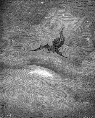
Dante's Inferno and
Paradise Lost (below); we can only imagine how he could have depicted such a devil as Mephistopheles.
I think the reason Dore didn't illustrate it is similar to the likely reason he didn't tackle
Gulliver, only this time it was Delacroix's heels he didn't want to tread on. As I mentioned above, Eugene Delacroix had illustrated
Faust in 1827. There were only seventeen lithographs but they are among the most famous illustrations of any period, and are perhaps the defining illustrations of the era Dore was working in. Goethe himself had praised them, even admitting that they at times surpassed his text.
It is also worth noting that there was no artist Dore respected and admired more than Delacroix. The influence can be seen in his work. There is little doubt that Delacroix's
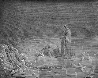
The Barque of Dante was in Dore's mind when he illustrated the
Inferno (above). The
Faust lithographs may have had an even bigger influence. The theatrical composition of Dore's folio engravings - the scenes are never viewed from an extreme angle - may owe something to the staginess of the layout in the
Faust lithographs, which may in turn have been influenced by the theatrical production of
Faust that would initially inspire Delacroix to illustrate the subject. The list of influences goes on, but I'll save them for another post. I do think, however, that Dore's style was sufficiently different to that of Delacroix, such that his own
Faust could have been an original take.
6. Victor Hugo, Notre Dame de Paris (1831)
An excellent novel with a cast of well-defined characters that lends itself well to illustration. There have been a few illustrated
Hunchbacks, with A. de Lemud's illustrations of 1844 a particular highlight. Fans should also watch the classic film starring Lon Chaney, which is in the public domain, so must be downloadable somewhere online.
In a way, Dore sort illustrated this one - he did a few drawings and watercolours, but no published illustrations, and he was never commissioned to illustrate it. The story is dominated by its Gothic setting, an appropriate stage for the extremes of passion and emotion that will take place. The gargoyles and spires of Notre Dame would have been ideal for Dore to illustrate, familiar as he was with Strasbourg cathedral, a mass of spires so densely populated with gargoyles that Notre Dame is a ghost town in comparison. (Incidentally, fans of the creatures of Strasbourg cathedral would do well to seek out a copy of
Cathedrale by John Howe.) Dore grew up in Strasbourg and passed the enormous cathedral every day. He became acquainted with the beautiful architecture and entranced by the legends attached to it. We can see how it informed his illustrations, particularly the world of
Contes Drolatiques and
Rabelais, with their forests of spires and steeples.

Of course, for much of his professional career Dore lived and worked in Paris. He depicted Notre Dame in his 1873
Rabelais, in which the giant Gargantua steals the cathedral's bells and an embassy from Paris begs him to give them back. Gargantua himself almost becomes one with the architecture in this illustration which demonstrates Dore's skill at depicting crowd scenes. Robin Allan speculates that it may have been a source for Disney's
Hunchback of Notre Dame.

As in
Rabelais (below) and
Contes Drolatiques, Dore would have been given the opportunity to depict the carnivalesque in the celebrations of the Feast of Fools. In his writings Victor Hugo declared a great admiration for Rabelais, so was as sympathetic to his world as Dore had proved to be.

Yet another reason Dore should have illustrated the novel is that he and Victor Hugo were friends. In 1866 Dore drew two small illustrations for Hugo's
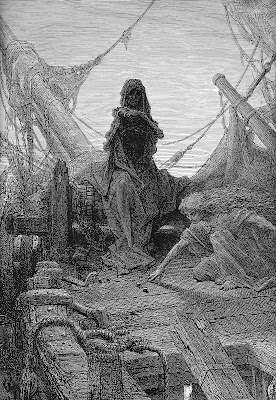
Toilers of the Sea, described by Dan Malan as 'barely an appetizer, by Dore's standards' (see a sketch below); Hugo, then out of Paris, wrote a letter to the illustrator expressing his immeasurable praise for these little engravings: 'your octopus is frightful, and your Gilligat is grand... To you I shall furnish the opportunity to create another monument.'
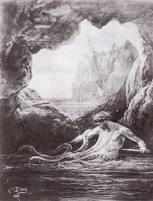
Hopefully Hugo's book will someday be published with the few drawings and watercolours Dore did make of the novel, but it deserved a proper set of illustrations. We have only a tantalising glimpse of what could have been.
7. Bram Stoker, Dracula (1897)
The second of what Stephen King has dubbed the 'Unholy Trinity' of Gothic Horror, the other two being
Frankenstein and
Strange Case of Dr. Jekyll and Mr. Hyde. Considering the number of movie adaptations that have been made, there have been relatively few illustrated editions of Dracula. This October saw the release of an abridged version for children with illustrations by Anne Yvonne Gilbert, which are beautiful but, ultimately, inaccurate to the spirit of the text and the character - the sympathetic, beautiful Dracula of these images perhaps owes more to
Twilight than Stoker. The 1997 illustrations by Tudor Humphries are excellent, an original but accurate take on the character. But the best illustrations are probably those by Barry Moser (who is, incidentally, something of a successor to Dore).
This is the first book on this list which it was physically impossible for Dore to illustrate - it was published fourteen years after his death. But the lingering terror in many of his illustrations, as well as his passion for the gothic and grotesque, is very appropriate to Stoker's novel.
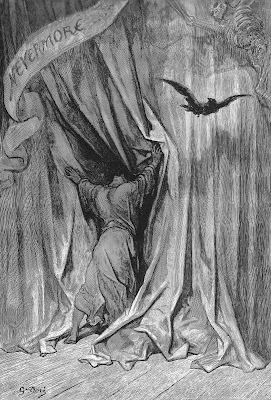
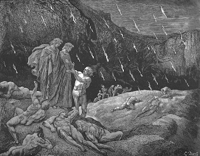
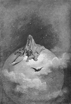
Gordon N. Ray found that Dore's illustrations for Poe's
The Raven (above) 'could serve equally well for Bram Stoker's
Dracula'. Combine these with
London; A Pilgrimage, the decaying faces and crumbling castles of
Contes Drolatiques and the demonic intensity of
Dante's Inferno (below) and you could quite comfortably fill an entire book, with images to spare.
Even though he never directly illustrated it, Dore still contributed to the iconography commonly associated with Dracula. The famous 1931 film adaptation by Todd Browning is generally disappointing visually save for some of the Transylvania scenes. The script included the direction that the scene where the disguised Dracula picks up his English visitor by coach should look 'like a Dore steel engraving'. Elements of Dore can be found in virtually every Dracula film from
Nosferatu to
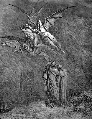
Van Helsing (the winged vampire brides in Stephen Sommer's film are dead ringers for the Gorgons of Dore's
Dante, though curiously with no nipples). 1934 saw the release of Max Ernst's surreal collage novel in five pamphlets,
Une Semaine de Bonte. The transformations and oneiric visions owe much to Grandville, but the elements of horror are very evocative of Dore. The red pamphlet for
Tuesday: The Court of the Dragon shows the inhabitants of a bourgeois household sprouting vampire wings. The wings in these collages are taken from Dore's
Paradise Lost illustrations. I will do some posts on
Une Semaine de Bonte soon.
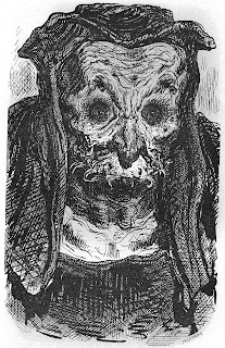
Mel Brooks' 1995 spoof
Dracula Dead and Loving It uses three of the
Dante illustrations (the first, third and seventh images) and one from
Contes Drolatiques (the twenty second, final image, above) in its opening credits (below).
Also used here are two images from
Une Semaine de Bonte (the second and tenth images); Fuseli's two
Nightmare images (the eleventh and eighteenth images); two illustrations from 1845-7's
Varney the Vampire (the thirteenth and sixteenth images); 'The Consequences' from Goya's
Disasters of War (the fifth image) and 'They Carried Her off' from his
Caprichos (the fifteenth image); and an illustration from
Le Diable Amoureux (the seventeenth image). I'm unable to identify the fourth, sixth, eighth, ninth, twelfth, fourteenth, nineteenth and twentieth images.
8. Edgar Allen Poe, Tales of Mystery & Imagination (1908)
One of the greatest writers - perhaps the greatest - of horror fiction. Edmund Dulac and Arthur Rackham both illustrated Poe. But the seething terror of the text is perhaps best depicted in the swirling decadence of Harry Clarke's illustrations, which you can see on the excellent
A Journey Round my Skull.
Nightmares in Decay: The Edgar Allen Poe Illustrations of Harry Clarke will be released on June 30 2010.
The
Tales were first gathered in the same volume in 1908, but of course they were written much earlier, all well within Dore's lifetime. Dore illustrated Poe's
The Raven (above and below), but before publication he died - possibly from sorrow, from the loss not of Lenore but of his overbearing mother, without whom he couldn't function. It's a pity Dore didn't get started on Poe earlier. The main reason seems to have been that the publishers were waiting for the copyright on Poe to expire. Dore's Raven coincided with Poe's entry into the public domain almost to the day.

Dore would surely have been excited and inspired by the Tales had he been given the task to illustrate them, with their emphasis on terror, death, pain, madness and mysticism. The spectre of Death, so familiar a figure in Dore's work, would have been allowed many more outings, appearing in person in
The Masque of the Red Death and lurking about in the metaphysical background of the other stories, as he does in
The Raven (below).
 9. Mervyn Peake, Gormenghast (1946-1959)
One of my all-time favourite books. To my knowledge there has never been an illustrated version, though Peake himself sketched the characters and once made drawings for a proposed
Gormenghast opera. It is a pity there is not a more complete set of illustrations from the author himself.

Another one that Dore never lived to see - he was maybe born a century too early. The Gormenghast trilogy seems ideally suited to Dore's style, particularly the first two, which recall his
Contes Drolatiques illustrations, with their endless cast of grotesque characters (above) and enormous, gothic mise en scene (below). The whole thing is tailored to Dore perfectly - the crumbling but steadfast walls of the immense castle; the forest of roofs up above; the characters, from the hideous (Chef Swelter, Secretary Barquentine) to the eccentric (Professor Bellgrove, Irma Prunesquallor) to the just plain mad (Nannie Slagg, Lord Sepulchrave).

Incidentally, Mervyn Peake was an excellent illustrator himself. His drawings for the
Alice books are arguably the most sympathetic to Lewis Carroll's sense of humour than any other set of illustrations. His son Sebastian was the model for Jim Hawkins in his amazing
Treasure Island drawings. I also love his interpretation of
Strange Case of Dr. Jekyll and Mr. Hyde. Like Dore, he produced an amazing set of illustrations for
The Rime of the Ancient Mariner. Before he died he had begun a set of illustrations for a proposed Folio Society edition of
Contes Drolatiques.
10. J. R. R. Tolkien, The Lord of the Rings (1954-1955)
Another great 20th Century trilogy. One of the finest stories ever written, and the closest Britain has come to having its own home-grown mythology. Tolkien himself drew many of the locations and scenes he described, most famously creating the maps of Middle Earth and Arda that appear in all of his books. The world he created has continued to inspire artists. For several years the Brothers Hildebrandt executed lavish oil paintings for Tolkien-themed calendars. John Howe and Alan Lee are the most famous Tolkien illustrators; both worked on Peter Jackson's film trilogy. Ian Miller has also done some amazing illustrations inspired by Tolkien. The best illustrations, however, are probably by Ted Nasmith.

Again, this is an incident where Dore was born a century too early. Then again, many often quip that Tolkien was born at least one century too late, so we can blame him too. All of Tolkien's work, from
The Lord of the Rings and
The Hobbit to
The Silmarillion and
The Unfinished Tales, would have been excellent material for Dore to illustrate. The atmosphere of Dore's
Orlando Furioso (above) is comparable that of Tolkien's epic world, with its fantastical creatures and enormous battles.
The vaguely Pre-Raphaelite world of the Elves would have a similar look to the
Idylls of the King illustrations. But Dore would have been most at home with monsters like Shelob and Ungoliant (see in particular his
Legende de Croque-Mitaine illustrations, above) and the evil parts of Middle earth, particularly Udun and Mordor, which is not dissimilar to the hell of
Dante (below) in appearance.